A restyle of the prescription section reached me already decided: keep the structure, apply the group's new design system. I proved in Figma that it couldn't ship. The components didn't exist yet, and the layout kept the real problem, the lack of vertical space. The software architect confirmed it and the Product Manager dropped the plan.
I then designed a modular screen where search and the ongoing prescription never leave view. Along the way, without being asked, I gathered settings scattered across eight sections into one dashboard. It changed the roadmap and was well received. Later, I led the decision on how the product migrates to the group's design system.
Context and my role
I'm the Senior Product Designer and reference designer for a clinical practice platform at Cegedim, used by doctors. I hold the view of the whole application, so I can see how sequences connect across sections. I also create, maintain and evolve the product's own design system on my own, and I'm the only Spain-based member of the team building the group's design system with France. Prescribing is its most safety-critical flow: a doctor under time pressure, a dense screen, and regulatory constraints.
- People involved: the software architect, the Product Manager, the Product Owner. I was the only designer.
- When: June 2025
The brief I inherited
The brief arrived decided: restyle the prescription section with the group's new design system, keeping the existing structure. Its goal was design-system adoption, not the problem doctors had with the screen. I wasn't part of that decision; my job, on paper, was to execute it.
Why it couldn't ship, and how I proved it
It failed on two fronts at once.
- Design system gap. The new system was young. Many equivalents of the product's components didn't exist yet, so a restyle meant building them first, and the release had no time for that.
- The original problem stayed. The layout kept the same structure, so it didn't solve what was actually wrong: the lack of vertical space.
Instead of arguing it, I built a proof of concept in Figma. To avoid mixing two design systems in one interface, I created a library of the new system's components with the product's styles. That exposed the real cost, which I worked through with the architect: three libraries to maintain.
| Library | What it is | Where it's used |
|---|---|---|
| Product library | The one the product had always used | The whole product |
| Group design system | The new corporate system, still incomplete | Internal dashboards not open to users |
| Hybrid library | Group components with the product's styles | What the restyle would have required |
I framed it as time spent in design and development, not as a matter of taste.
Getting the architect, then the PM, on board
I went to the software architect first. The architect confirmed the diagnosis: if the section was going to ship, it had to use the product's own library, not the new system.
With that technical backing, I took it to the Product Manager. The original plan was dropped. We agreed on a layout similar to other sections of the product, and left the integration with the new design system for a future version.
The reframe: search and the prescription always in view
A layout close to other sections kept the product consistent and buildable with existing components. Inside it, I defined a modular system around what a doctor can't lose while prescribing:
- Always visible, one click away: the search bar and the ongoing prescription, with every medicine added before it is validated.
- One central module that changes: search results, favourites, history, chronic and active medication.
Secondary content takes the central space when it's needed, without pushing search or the prescription out of view.
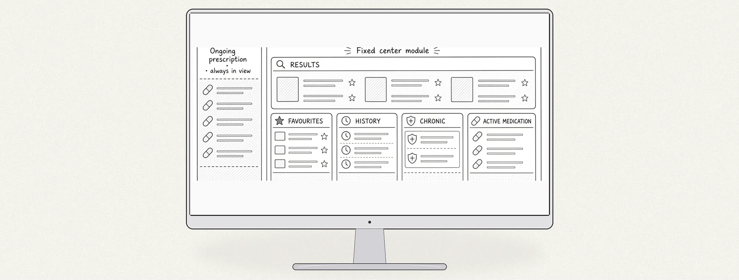
Validated by the Product Committee, a fortnightly panel of doctors.
Beyond the brief: one dashboard for every setting
The complexity of the section led me to look at its settings. Prescription alone had a long list: general parameters, dosage, search options and alerts. Seven other sections had their own, each kept inside its section, so changing one meant knowing where it lived. Nobody asked me to fix this; it came out of the analysis. I gathered every parameter from all eight sections into a new settings dashboard.
Doctors reach it two ways:
- From any section: the dashboard opens at that section's settings.
- From the subheader: a general search across all settings.
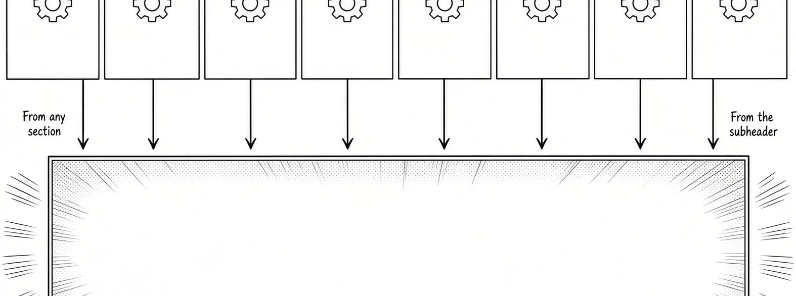
The modular screen and the dashboard shipped together, in the version I defined.
What it led to: a rule for the migration
The product's own library has an end date: the plan is to migrate to the group's design system. The question the proof of concept raised, how to move without mixing two systems, still needed an answer.
I led that debate with the architect, the Product Managers and the Product Owners, and made the call. Since June 2026, every new full section, modal with a backdrop or full-width dialog is designed and built in the group's system. Each of those surfaces uses one visual language, so doctors never see two styles mixed in the same interface.
Once the group's system is complete, the next step is a migration method based on its foundations.
Outcome and what I learned
The outcome is a decision, not a number. A restyle that couldn't ship was stopped before it was built, and the settings dashboard changed the roadmap. Doctors never asked for it, yet the PM heard from two of the most important clients that it was well received, because every parameter is now controlled from one place.
- A restyle is not a redesign. Check the brief against the original problem before designing it.
- A prototype with a cost ends debates. The proof of concept turned a matter of taste into a matter of time.
- Engineering before product. The architect's backing made the PM conversation about trade-offs, not opinions.
- A whole-product view finds what no brief lists. The dashboard came from seeing settings across sections.